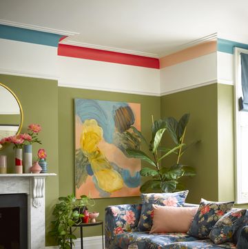
Sherbet shades are inherently sweet, but it doesn’t mean they can’t make a statement. These homes from the ELLE Decoration archives show how soft colours can be paired with contrasting palettes, statement furniture and clean lines to create contemporary, uplifting spaces that stay well away from becoming saccharine.
A super-sweet kitchen in Copenhagen
Interior designer and colour consultant Nadia Olive Schnack was perusing Farrow & Ball’s archive when she came across the shade ‘Sugared Almond’. Immediately, she knew she had to use it in her Copenhagen home and went about cloaking the kitchen, bespoke cabinetry and all, in the vibrant lilac. It was, she says, ‘meant to be’. Neon artwork by German abstract painter Rupprecht Geiger complements the sugary space.
The New York home inspired by Wes Anderson
Michael Chen, architect and founder of studio MKCA, was determined to avoid the typical brownstone aesthetic – think white walls and a drab kind of tastefulness – when designing this Brooklyn home. And so he turned to the cinematographic world of Wes Anderson, harnessing the filmmaker’s signature use of colour. The living room is drenched in Benjamin Moore’s ‘Palazzo Pink’ while the study is cloaked in sunshine yellow.
Wall to wall pastels in a London home
London designer Sam Buckley has built a reputation for going full throttle with colour schemes and this 1980s home in south London is no exception. The living room is a masterclass in using a pastel palette, with the pistachio green wall and Hay’s ‘Mags’ modular sofa surrounded by curtains made from ‘Technicolour Flux’ sheer fabric by Peter Saville for Kvadrat.
The Brutalist icon with a soft pink centre
When designing this apartment in Udine’s iconic brutalist Residence Club, designer Cristina Celestino took inspiration from the colours and materials used by the original architect Massimo Camillo Bodini. The soft baby pink of the building’s communal hallway became the starting point, inspiring a palette of pink and peach in the custom two-tone kitchen.
The London home with colour in every corner
‘It was an amazing opportunity to combine pattern and colour in a way that many clients wouldn’t embrace,’ says Katie Glaister co-partner of K&D Design of this uplifting home in Notting Hill. There is colour in virtually every corner of the home, starting with the acid yellow front door that opens onto pastel-hued hallway tiles, and the kitchen with a central island topped with minty green Pyrolave (a type of enamelled lavastone) and pale blue larder.
What's everyone reading?
The Copenhagen home with pastels from floor to ceiling
Glossy lemon yellow, pale blue and baby pink run throughout this home in Copenhagen’s Østerbro neighbourhood designed by homeowner Johanna Rosén. The pastel hued-home is made even calmer by draped curtains that create a cocoon-like effect. In the bedroom, glossy yellow flooring is paired with soft pink bedding and a lustrous velvet curtain divider.
A masterclass in colour by Masquespacio
The home and showroom of Valencian design studio Masquespacio was only ever going to be one thing: colourful. With a palette that spans the softest of pastels to the zingiest of neons, it’s an electrifying space that showcases the studio’s tenacious approach to design. The minty green living room features curtains from Kvadrat, which serve to soften the industrial space, while a lemon yellow custom sofa designed by the studio takes pride of place.
The London home that’s in the pink
This Primrose Hill home is an ode to the power of pink. Despite designer Collette Ward’s personal aversion to the shade, the uplifting home is a perfect balance of bubblegum pink, jaunty print (the pantry is covered in Sanderson’s ‘Alice in Wonderland’ wallpaper) and rooms cloaked in rich darker colours to counter balance the inherent sweetness.
A pastel palette paired with forest green in Milan
Sugary pastels are paired with a rich forest green in this Milanese home designed by Marcante Testa. The kitchen features bespoke cabinetry in soft mint and sky blue, while elsewhere floral prints, like ‘Vårklockor’ wallpaper by Josef Frank for Swedish brand Svenskt Tenn, bring the outdoors into this city home.
The Warsaw home that dials up the colour contrast
Pastel pink is paired with punchy cobalt blue in this kitchen designed by Katarzyna Baumiller Studio. It’s just one of the unexpected colour pairings that define this Warsaw home, in which dip dye curtains in rich purple and blue are paired with zesty orange and yellow furniture pieces.


