When the world outside is raging beyond your control, there is something incredibly nurturing about stepping into a calm, neutral space. ‘Life has been incredibly trying for all of us, for some time now,’ says Cassandra Ellis, colourist and founder of Atelier Ellis, makers of handmade, natural paints. ‘When everything has been too complex and “heavy”for too long, we need a palate cleanser – something to wash away the excess.’
Add to that a geopolitical backdrop of brash politicians, explosive headlines and social-media storms, and ‘none of us feel splashy or garish right now,’ says Emily Potter, co-founder of Daytrip, a London-based design studio specialising in architecture and interiors. ‘A neutral interior is calm and reflective, a place of refuge. It just feels right for this moment in time.’
Welcome to spring’s new mood: a next-generation minimalism, emerging in the interiors of the most forward-thinking. Of course, minimalism has been popular for millennia in various forms – influenced by the aesthetic of Japan’s traditional Zen Buddhism and Nordic pared-back living. On Instagram it has nearly 27 million posts. But we’ve also tired of the most recent incarnations, from the 1980s magnolia trends to 90s polar white and the most recent fashion for greige (leading to recent social-media parody accounts of those living the ‘officialsadbeige’ life).
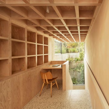
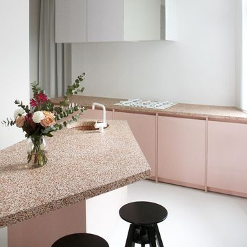
Instead, 2023’s modern minimalism is a rich tapestry of warm, textured neutrals, surprising pops of dark woods, rich fabrics (mohair or cashmere) and juxtaposing industrial metals. The look takes its cues from nature: organic paint pigments, sustainable woods and recycled materials make up the backbone of the room.
‘If you use something synthetic, then you’re really controlling the look, but when you opt for something more natural, you can get beautiful surprises with variations in the material,’ Potter says. ‘In a warm, minimalist palette, there’s a lot of qualitative tonal information.’
You might want to begin by casting aside the clutter and detritus of winter to reveal a more minimal, spring-like space. ‘Streamlining what you have is an important step to feeling less overwhelmed and more in control,’ says Louisa Grey, founder of House of Grey, a studio focused on a holistic approach to interior design. ‘I found that purging a lot of my possessions made me feel happier at home. For me, silence and a space to think are two crucial aspects of a home that is nurturing and healing.’
What's everyone reading?
Then, you’ll want to tackle the walls. Gone are the flat, stark white paints of old minimalism that aim to hide any imperfections in the wall beneath. Ellis says that her neutral paints, whilst outwardly simple, are richly pigmented. ‘We use between three and eight pigments for all of our neutral shades – avoiding that use of black as an undertone – so that they change in the light and wrap around the space.’
‘For me, it’s been a lifetime search for the perfect off-white,’ says Sophie Pearce, director of the east London design store and gallery space, Béton Brut. ‘Nothing too grey, nothing too beige, crema or pink-toned – I’m looking for the type of off-white that looks as if it’s reached its tone from age, rather than added pigment. It’s possible to tire of the latest colour shades, but off-whites and neutrals represent something more constant and long-standing. Done right, they radiate the light of the sun into our homes, and bring mental clarity and a neutral canvas on which to stretch our imaginations.’
A simple hack is to use limewash paint, for the depth of texture and versatility it provides. ‘Even whites have more depth and nuance in limewash,’ says Bronwyn Riedel, founder of the modern lime-paint company, Bauwerk. Grey is another fan (she has her own range with Bauwerk called ‘Visual Silence’), admiring the ‘soothing, calm and gentle feeling it brings to a room.’
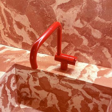
Of course, it doesn’t stop there. A modern, neutral interior is brought alive by the other elements and materials in the room, which are often cast in warm woods, industrial metals and textured fibres. ‘I might use five stones that are similar at first glance, but if you take a closer look, the differences reveal themselves. I like playing with finishes too – burnt wood or burnished metal,’ says Mimi Shodeinde, founder of the interior-architecture studio, Miminat Designs.
Potter agrees that depth is achieved in textured detail, citing a recycled glass tabletop she installed in a recent project: ‘Looking at it makes you feel as if you are gazing across an ocean,’ she says. ‘It’s incredibly beautiful.’ But while she paints a restful image, it doesn’t mean that modern neutrals are exclusively meek and mild – instilled in the ethos is a quiet confidence that can harness a lot of spunk. ‘A neutral space can still have attitude,’ Potter says. ‘It’s not an apologetic look, it’s got energy and fun about it.’
That fun can come from using unexpected materials to create new and less hackneyed textures (pale Scandi woods and bouclé wool are by now too Instagrammed). Pearce recently worked with former Faye Toogood designer, David Horan, to create a collection of off-white furniture and lighting made of paper.
‘Playing with techniques such as decoupage, he has achieved some brilliant new textures with neutrals, such as a layered and lacquered washi that mimics vellum and parchment,’ she says. In a similar vein, she admires the experimental works of Vincenzo De Cotiis in hand-painted, recycled fibreglass.
Potter, meanwhile, likes to look for new ideas in her ‘material library’. ‘We take inspiration from everything,’ she says. ‘A sample of flooring might come wrapped in a recycled, textured packaging and we can almost be more interested by that.’
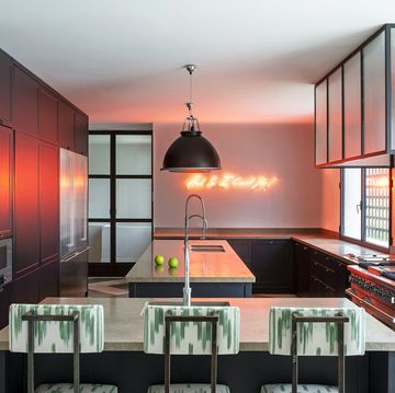
To pack their powerful yet disarmingly understated punch, modern neutrals need to embrace a sense of drama, which can come from dialling up light and contrasts. ‘I often add strong contrasting monochromatic elements, or even sometimes experiment with metallics and mirrors,’ Shodeinde says. ‘I love the way light can bounce off these surfaces to create shadows on the walls and the furniture, creating drama without relying on a bold colour or pattern.’
For the slightly less adventurous, it’s an effect that can be achieved via the juxtaposition of materials. Pearce admires combinations ‘of aged white with sheet metals, such as untreated steel and bronze’ as seen in Béton Brut’s dramatic ‘Archive for Space’ tables.
The complexity that 2023’s minimalism brings us is intoxicating. What seems simple is a treasure trove of sensory information in exciting new materials, and a subtle form of self-expression, hidden – almost literally – in the shadows. It’s a way of decorating that doesn’t overwhelm our senses (important in an overstimulating world) but quietly nurtures, supports and delights. And who amongst us doesn’t crave that right now?
How to harness new neutrals
A minimal interior can all too easily slip into bland territory. Here’s how to make sure you’re on the right side of this subtly influential trend
Avoid picking one flat colour. ’I would use small variations in the colour palette, which makes each space within slightly different yet cohesive,’ advises Bauwerk’s Bronwyn Riedel. ’This creates a subtle mood, light and colour shift between the spaces.’
Don’t be afraid of shadows. ’We need light and dark at home, and as much as pale colours stimulate us, we require shadowed space for intimacy and thought,’ Atelier Ellis’s Casandra Ellis says.
Use contrasting finishes or surprising formats. ’For example, high-gloss walls and ceilings, or a lacquered parchment coffee table paired against deeply textured matte upholstery,’ says Sophie Pearce, the founder of Beton Brut.
Look for handmade to provide texture and charm. For Daytrip’s Emily Potter, ‘handmade zellige tiles could be plain, but because each tile has a variation to it there is added interest’.
Use natural, tactile accessories liberally. They’re an incredibly calming, easy addition that can add instant warmth to a neutral scheme. Fred Rigby’s wooden plates are a good example: functional tableware that also has an ornamental quality.


